Designing pension comms to pack a punch
Presenting pensions information in a user-friendly way can be a challenge, but one where design can play a vital role. To grab members attention and keep them engaged, here are a few ways we use design and graphics to fine tune good content into polished and engaging communications…
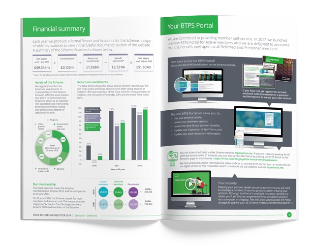
Typography
Breaking large amounts of copy down into punchy sections and establishing a typographical hierarchy for headings, paragraphs, pull-out quotes, hyperlinks etc. helps bring about order and allows the reader to prioritise information. By doing this, members can see top level information at a glance and drill down to the detail if they want to learn more.
Iconography
By tapping into common visual language using a set of cohesive icons we can add colour and visual interest whilst communicating an idea quickly. Icons are particularly useful in digital communications where they represent something functional, like a play button or in a navigation menu on a mobile device where space is at a premium.
Charts
These can be a useful way to ‘shine a light’ on key facts and figures. There are a multitude of options to show different types of data, and for websites charts can be interactive, displaying sets of specific data by tapping or clicking on headings.
Infographics
Where a collection of data or a process, requires explanation, sometimes an infographic is the best solution. Infographics are a collection of imagery, charts and key text which collectively convey information quickly and clearly. As with all good design elements, as well as being visually interesting and engaging, the key point is that the infographic communicates and helps the reader understand the content.
All of the above should be produced in a way which incorporates elements of the brand identity, ensuring that all communications are consistent in look and feel, are easily recognisable and carry the right tone.